File Structure
Within the download package fo you will find a folder called yaml with
the following file stucture. This folder contains all components of the framework and
should stay unchanged for easy updating.
If you want to modify any file, put a copy in your local CSS folder and reference it from there
yaml/
├── add-ons/
│ ├── accessible-tabs/
│ │ ├── jquery.tabs.js
│ │ └── tabs.css
│ ├── microformats/
│ │ ├── icons/
│ │ └── microformats.css
│ ├── rtl-support/
│ │ ├── core/
│ │ │ ├── base-rtl.css
│ │ │ └── base-rtl.min.css
│ │ ├── navigation/
│ │ │ ├── hlist-rtl.css
│ │ │ └── vlist-rtl.css
│ │ └── screen/
│ │ └── typography-rtl.css
│ └── microformats
│ └── jquery.syncheight.css
├── core/
│ ├── base.css
│ ├── base.min.css
│ ├── iehacks.css
│ └── iehacks.min.css
├── forms/
│ └── gray-theme.css
├── navigation/
│ ├── hlist.css
│ └── vlist.css
├── print/
│ └── print.css
└── screen/
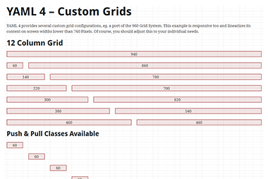
├── grid-960-12.css
├── grid-960-16.css
├── screen-FULLPAGE-layout.css
├── screen-PAGE-layout.css
└── typography.css
Core Components
Part 1: Framework Base "base.css"
yaml/core/base.css
The stylesheet base.css in the folder yaml/core/ is the first and most important core-file of the YAML framework. It lays the foundation (browser normalisation, layout-modules eg. grids, forms etc.). This stylesheet is required for every YAML-based layout and should not be changed!
List of Core Modules
| Module |
Classes |
Short Description |
| Normalisation |
- |
This module provides a reliable foundation for development by crossbrowser-normalizing the visual style for the most important elements. YAML offers an optional typography module containing default styles for all typical semantic HTML elements with an em-based (proportional to base font-size) vertical rhythm. |
| Layout |
parent class
.ym-wrapper
optional class
.ym-wbox |
The layout module defines a layout-wrapper and default values for minimum and maximum width. |
| Grid |
parent class
.ym-grid
child classes
.ym-gl
.ym-gr
.ym-g[xx]
optional classes
.ym-equalize
.ym-gbox
.ym-gbox-left
.ym-gbox-right |
The grid module provides flexible, nestable grids. Standard column widths are based on percentages. Optionally, all columns within a grid row can have equal height. Grid sizes can be extended/customized with user-defined CSS classes. |
| Column |
parent class
.ym-column
child classes
.ym-col[1|2|3]
optional classes
.ym-cbox
.ym-cbox-left
.ym-cbox-right |
The column module divides a content area horizontally into a set of 2 or 3 columns whose widths can be defined in arbitrary units [px, em, %]. Column order can be defined via CSS by the user. |
| Form |
parent class
.ym-form
row wrapper
.ym-fbox
.ym-fbox-footer
.ym-fbox-wrap
IE6 helper classes
.ym-fbox-text
.ym-fbox-select
.ym-fbox-check
.ym-fbox-button
optional classes
.ym-full
.ym-columnar
.ym-inline
.ym-required
.ym-error
.ym-message
.ym-label
button classes
.ym-button
.ym-small
.ym-xsmall
.ym-large
.ym-xlarge
.ym-primary
.ym-success
.ym-warning
.ym-danger
|
The form module provides the standard building blocks for designing robust flexible forms and offers three positioning options for arrangement of labels and form elements. YAML strictly separates structural form design (base.css) from visual styling of the form, to enable easy theming. |
| Float Handling |
float clearing
.ym-clearfix
float containing
.ym-contain-dt
.ym-contain-oh
.ym-contain-fl |
This module offers several classes to handle floated objects within the layout. The .ym-clearfix class enables markup-free clearing of floats. The other predefined classes can be used to contain floated elements (or to handle unknown content in general, e.g. user generated content). |
| Accessibility |
parent class
.ym-skiplinks
child class
.ym-skip
optional classes
.ym-hideme
.ym-print

.ym-noprint |
The accessibility module provides a robust, layout-independent implementation for skip links. Furthermore it contains CSS classes to make content accessible for screen readers but hide them in visual media or make them visible only in the printed output. |
Part 2: Support for old Internet Explorer versions "iehacks.css"
yaml/core/iehacks.css
The stylesheet iehacks.css from the yaml/core/ folder is the second core component of the YAML framework. It contains all the structure- and layout-independent bugfixes for Internet Explorer (versions 5.x/Win - 7.0/Win). This bugfix-collection is essential for the robust and error-free presentation of YAML-based layouts in old Internet Explorer.
This stylesheet is optional but required for legacy support of old Internet Exlorer versions prior IE 8 and should remain unchanged! Many bugfixes exploit IE's numerous parser bugs - particularly those in older IE versions. The resulting CSS code is therefore not always valid and should thus only be made accessible to IE. This is possible with the use of Conditional Comments in the <head> of the document. The Conditional Comment has to be included below all regular stylesheets.
List of IE 6,7 bugsfixes provided by iehacks.css:
- fixes italics bug
- fixes disappearing list-background bug
- fixes list-numbering bug
- fixes guillotine bug (IE6, in most cases)
- fixes doubled float-margin bug (for YAML's structural elements)
- workaround for expanding box problem
- removes additional paddings in buttons
- triggers hasLayout for HTML5 elements and YAML's structural elements
- activates bicubic interpolation for image scaling
- several stability fixes for YAMLs layout modules
Basic HTML/CSS Template
Here's a template of an empty HTML5 file containing the integration of YAML's core stylesheets:
<!doctype html>
<html lang="en">
<head>
  <meta charset="utf-8"/>

  <title></title>
  <meta name="description" content=""/>
  <meta name="author" content=""/>

  <!-- mobile viewport optimisation -->
  <meta name="viewport" content="width=device-width, initial-scale=1.0">

  <!-- stylesheets -->
  <link rel="stylesheet" href="yaml/core/base.min.css" type="text/css"/>
  <link rel="stylesheet" href="css/styles.css" type="text/css"/>

  <!--[if lte IE 7]>
  <link rel="stylesheet" href="yaml/core/iehacks.min.css" type="text/css"/>
  <![endif]-->
</head>
<body>
  ...
</body>
</html>
For both core-files, minified file versions are provided. base.min.css weights only 4.6 kB and iehacks.min.css has a filesize of 2.1 kB. Use them for your production code. For development and a deeper understanding of the framework use the non-minified, commented file versions.
Of course, you can build your layouts on XHTML 1.0 or HTML 4 Strict. YAML only requires the browser to be in Standard Mode. In Quirks Mode, YAML can't provide IE6 and 7 support.
Central Stylesheets for Improved Development Workflow
For prototyping and working with several, reusable stylesheets, YAML uses central stylesheets that import all other stylesheets. This reduces HTML changes (think of Content Management Systems) to a minimum during development.
<head>
  ...
  <link rel="stylesheet" href="css/central.css" type="text/css"/>
	  <!--[if lte IE 7]>
  <link rel="stylesheet" href="yaml/core/iehacks.min.css" type="text/css"/>
  <![endif]-->
	</head>
Here's an example for how such a central stylesheet could look like:
/* Google Font API */
@import url("http://fonts.googleapis.com/css?family=Droid+Serif");
@import url("http://fonts.googleapis.com/css?family=Droid+Sans:700");

/* import framework core */
@import url("../yaml/core/base.min.css");

/* import screen layout */
@import url("../yaml/navigation/hlist.css");
@import url("../yaml/forms/gray-theme.css");

@import url("screen.css");
@import url("typography.css");

/* import print layout */
@import url("print.css");
For production use, all stylesheets should ideally be concatenated and minified to reduce HTML requests and bandwidth of course.